I'm around and round we go
Moderator
Jun 18, 2011 14:26:52 GMT -5
Very helpful, although for newbies the big lines of code can be daunting. It sort of makes newbies think it is way to complicated.
if you think these are big lines of code, you should see some of the info centers and mini profiles and main page mods

These are only simple JavaScripts and CSS, which doesn't slow the forum down at all.
Jun 18, 2011 16:38:05 GMT -5
Hi! I've been tasked with doing a few forums for people because I do well with making graphics, so this site has been like a shinning beacon of hope for me. I have a question about the second backround though. I was wondering if there was a way to adjust it to a certain pixel width. I've been using
this code here for different skins, but when using this there is a very wide second backround, and if I adjust the width in the second backround code you're using here, it displays weirdly for people with smaller resolutions than mine. I think setting a specific width for the second backround would fix that? But I dont know how to code myself yet, just tweak codes I find.
I'm afraid if i tried to code something I would blow something up.
My personal suggestion is for you to make an account here and check out other code. It gives you actual insight on how things work and if you continue doing so you will be able to make your own stuff on the fly.
Done!

I actually have been looking at other codes and adjusting them and playing around to get a better grip on what I want to do. I'm still figuring things out though, and I still dont get how to constrain the second background to a specific pixel width, which is what I'm trying to understand. Help?

Jun 18, 2011 16:39:00 GMT -5
Also because i didnt say it yet, this tutorial is extremely helpful and awesome!

I'm around and round we go
OP
Moderator
Jun 18, 2011 16:45:23 GMT -5
To edit the width of the second background change this part:
<style>
body {
text-align: center;
}
.secondBackground {
margin: 0 auto;
background-color: rgba(255,255,255,0.5);
-moz-border-radius: 10px;
-webkit-border-radius: 10px;
border-radius: 10px;
width: 92%;}
</style>
<div class="secondBackground">
Jun 18, 2011 16:53:51 GMT -5
Yeah, I was changing percents, and having issues with the way that smaller percents displayed on people's smaller resolutions. For some reason I never tried changing "92%" to "800px", which is what I wanted: constraining it to a specific pixel width. Lets chalk it up to a dumb blond moment from me and call it a day

I'm around and round we go
OP
Moderator
Jun 18, 2011 17:02:33 GMT -5
Yeah, I was changing percents, and having issues with the way that smaller percents displayed on people's smaller resolutions. For some reason I never tried changing "92%" to "800px", which is what I wanted: constraining it to a specific pixel width. Lets chalk it up to a dumb blond moment from me and call it a day

It happens

I probably should've made that a bit clearer, it can get confusing when you try to accommodate others' monitor resolutions.
I only used 92% because it was the default ProBoards forum width.
Jun 18, 2011 19:41:05 GMT -5
Yeah, weird things were happening when I started making the second background at low percents to match what it was supposed to look like with the forum width I was using. I only wanted a little of the second background to show but at the sizes it worked on smaller moniters it was enormous on my screen. For some reason I expected constraining to a pixel size rather than a percent to be much harder than it was. Thanks a ton!
Jun 23, 2011 14:43:41 GMT -5
I have made some different forum skins and needless to say that this one is probably the best one I have made so far.
This tutorial is amazing and super helpful! Thank you, Smangii!!!
~Dara

Jul 1, 2011 20:53:19 GMT -5
Using it as I type now ❤ Thanks for all the wonderful codes!!! I definitely LOVE the border under the titles and categories

I'm around and round we go
OP
Moderator
Jul 2, 2011 0:58:09 GMT -5
Using it as I type now <3 Thanks for all the wonderful codes!!! I definitely LOVE the border under the titles and categories


I like the little touch myself. Glad to be of service

Jul 2, 2011 5:48:28 GMT -5
This is the first time I've put the effort in to reading this, such as great job on this Smangii. You must have huge amounts of patience.
I'm around and round we go
OP
Moderator
Jul 2, 2011 12:28:36 GMT -5
This is the first time I've put the effort in to reading this, such as great job on this Smangii. You must have huge amounts of patience.
I actually had about 24 hours with absolutely NOTHING to do, so I figured why not, since it has been something I've always wanted to do

And thanks for reading =D
Jul 2, 2011 19:36:44 GMT -5
I wish something like this was available when I was a noob!
I'm around and round we go
OP
Moderator
Jul 8, 2011 18:49:17 GMT -5
Like this:
<style>
.titlebg { background-image: url(http://yourimg.in/m/7r93w4f.gif); }
.catbg { background-image: url(http://yourimg.in/m/7r93w4f.gif); }
.menubg { background-image: url(http://yourimg.in/m/7r93w4f.gif); }
</style>
Aug 6, 2011 20:37:33 GMT -5
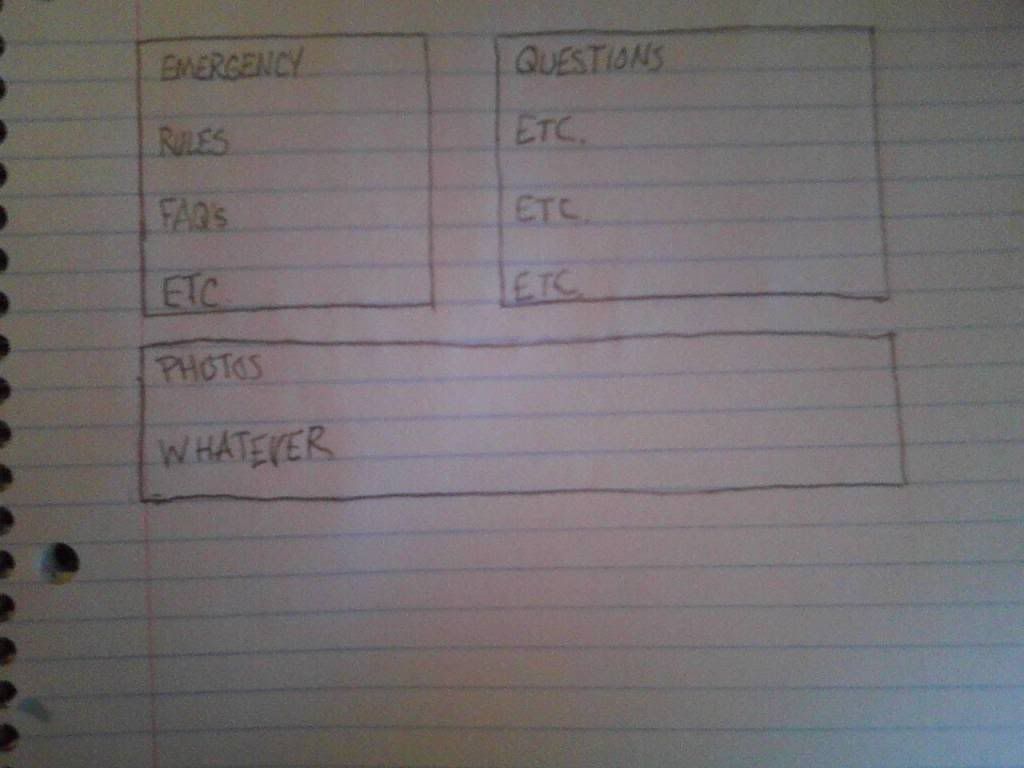
I was wondering if anyone knew how to make the forum look more like a newspaper. Separate the categories into three or more parts and put two groups next to each other... kind of like this.

Thanks,
O.M.
Aug 25, 2011 10:36:10 GMT -5
There was one code that I was having issues with, the resize welcome center.
Here's the code:
<scri!pt>
document.getElementsByTagName('table')[0].style.width='600px';
</script>
Aug 25, 2011 12:20:25 GMT -5
Like this:
<script type="text/javascript">
<!--
document.getElementsByTagName('table').item(0).width = '600px';
//-->
</script>
Sept 5, 2011 21:28:33 GMT -5
I just though I'd thank you for the tutorial, it's awesome and has really helped me improve my first proboards site

! Idiot proof ^^!
Sept 25, 2011 19:34:37 GMT -5
I'm very happy to have found this tut, I was getting very frustrated by what I was trying to do as a newbie.
I see you took out the part of 'Hey, you have a messaage'.....I didn't see it put back, so what do you do about your messages?
thanks again for making a great tut.
Ruth
Sept 27, 2011 22:24:30 GMT -5
I'm very happy to have found this tut, I was getting very frustrated by what I was trying to do as a newbie.
I see you took out the part of 'Hey, you have a messaage'.....I didn't see it put back, so what do you do about your messages?
thanks again for making a great tut.
Ruth
In the Information Center, there is a bit that says "Your Personal Messages: 0 New 0".
Sept 28, 2011 10:23:38 GMT -5
This is awesome. Made it so easy for a newbie like me to use. THANK YOU!!!
I'm around and round we go
OP
Moderator
Sept 28, 2011 10:42:46 GMT -5
This is awesome. Made it so easy for a newbie like me to use. THANK YOU!!!
You are welcome

In response to above, there are many private message codes that you can add to your forum too.
Oct 9, 2011 1:46:00 GMT -5
You posted your tutorial forever ago, but it really is great. Thank you very much for sharing.
-Necro
Nov 4, 2011 20:12:28 GMT -5
The tutorial is great, but I have a few questions.
Most of the codes won't work for me, I input them, and they disappear. Does anyone know why?
I'm a beginner, still trying to wrap my head around coding, it's quite possible that I have just done something wrong, but, as the saying goes, "
The first step to remedying ignorance is to admit it." So, admit it I have, and I hope to get my problem resolved.


 These are only simple JavaScripts and CSS, which doesn't slow the forum down at all.


 Glad to be of help!


 ! Idiot proof ^^!


