I'm around and round we go
Moderator
sounds like fun on a bun!
Dec 31, 2016 6:16:27 GMT -5
As the banner for sI i think it's fantastic.
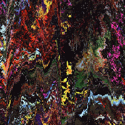
As a separate piece, while I ADORE the lil fishies in the blue circle, I feel the piece is too... tall. It feels neater and more. Not compact, exactly but more focused? Like, better focal point I guess, which despite the business falls somewhere between the orange half circle and the light blue half-circle split. On the full view piece it winds up falling to the lowest point and winds up feeling a little less concise.
IDK if I'm making sense.
That's really my only criticism though. It looks like it repeats, at least L > R (which btw, if so well done because I can't tell immediately and also making good repeating stuff is hard af), the colours are excellent and I just really overall enjoy the composition and design choices.
EDIT: OK maybe I loaded a cached page and you changed the positioning on the banner....? But now the fishies are in focus in the banner and I like that even more. The forum title is much easier to read, too.
I'm around and round we go
OP
Moderator
Dec 31, 2016 13:22:24 GMT -5
Kami Yep - since I went into this thinking it was going to be a banner I didn't really want there to be one focus, I wanted that to come from the user depending on where the banner "loaded" (a couple refreshes you'll see I am moving the position around). I kind of wanted you to find something new/different every time you looked at it, I always admire pieces that do that... whether I succeeded is a different story

THANK YOU. Yep I do have it TRYING to repeat left and right, I think I did it pretty seamless? Doing top to bottom is much harder.
The banner on SI is actually a flipped version of the final piece, when putting the composition into place I realized I liked the way the logo/text fell on the left side better when the version was flipped

Feb 28, 2017 18:04:36 GMT -5
Its Flat and bland tbh I can add to it when I'm free if you want?